Pages

Sunday, 28 July 2019

Summer Art Challenge Part Two - TomatoFest

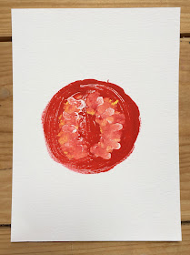
For the last few days, I've been obsessing about tomatoes. Not eating them so much but painting them, drawing them, printing them.


The experience has been slightly reminiscent of that surreal nursery rhyme:

'Solomon Grundy born on Monday;
christened on Tuesday;
married on Wednesday;
fell ill on Thursday;
worse on Friday;
died on Saturday;
buried on Sunday;
and that was the end of Solomon Grundy.'

This appears, at first sight, to be a macabre tale about a short-lived person but in fact, it's not about a person at all; it's about a grand, mixed salad, what the French call 'une salade composée', popular in 18th C England, known as 'salmagundi'. 'The word 'salmagundi' became corrupted to 'Solomon Grundy' and the rhyme was a humorous take on the fact that the dish often resulted in leftovers, of progressively deteriorating quality. Somewhat inevitably, as the recipe included a huge number of ingredients* rendering it difficult to make in small quantities and so it usually had to be eaten up for a number of days afterwards. In the absence of refrigeration, that meant it might well be 'off colour' or, more probably, just plain 'off' by the end!

*In 'The Good Huswives Treasure', an anonymous English, late 16th C cookery book, the ingredients are given as follows: cold roast chicken (or other meat), minced tarragon, chopped onion, capers, olives, samphire, broom-buds, mushrooms, oysters, lemon and orange slices, raisins, almonds, figs, potatoes, peas, red and white currants. The salad was finished with a drizzle of oil and vinegar dressing and garnished with more orange and lemon slices. A wonderful dish for a party but not something that would necessarily keep for more than a day after making, I would have thought, let alone a week!

My simpler salad focus has just been on the one ingredient but nevertheless I am conscious I may have now done them to death and must move on to something else!

It started with discovering a YouTube video by Finnish artist, Paivi Eerola, about using her Gelli plate to print an image of the tomatoes and apples in her garden. I found watching how she built up the image mesmerising. Have a look - you can find the video here. Paivi also has an art blog Peony and Parakeet. Very encouraging and inspiring.

Anyway, back to the tomatoes. We eat a lot of tomatoes, especially in the summer so there are always some in the fruit bowl in the kitchen - I don't like eating them chilled from the fridge - I find the cold spoils the flavour and scent. There is a simplicity about their shape and colour that is very appealing. And suddenly I found them popping up, not so much on my plate, as in my sketch book and elsewhere. Whole tomatoes, sliced tomatoes, tomatoes in salads, tomatoes on the vine, impressionistic tomatoes, Andy Warhol-style tomatoes etc 'Born on Monday, christened on Tuesday, married on Wednesday'  etc etc - you get the picture! And now my red printing ink has run out and 'that was the end of Solomon Grundy'! Which may be just as well!

'Born on Monday' ... pencil drawings...


'Christened on Tuesday' ... Gelli prints...


'Married on Wednesday' ... postcards using Gelli print and adding detail with a brush and gouache paint ...


'Fell ill on Thursday' ... more postcards...


'Worse on Friday' ... Gelli print envelopes with additional gouache paint details ...


'Died on Saturday' ... poster-style recipe cards


'Buried on Sunday.
And that was the end of Solomon Grundy.'
(and probably, for the time being, my tomato-obsession!)

E x


Thursday, 25 July 2019

Summer Art Challenge Part One - Marking Time

This year, Slamsey's Creative Summer Challenge, with its focus on regular creativity, has several different prompts rather than a single one each week. To get over the daunting barrier of the blank page, Tuesday's prompt was to 'make a mark'. I love this phrase because it's so generously enabling. You don't have to have any developed artistic skills to 'make a mark'. All manner of simple possibilities offer themselves from using dilute watercolours to paint a wash of background colour, to cavalier spills of ink drops, spatters of acrylic paint from an old toothbrush, or simple geometric patterns, drawn or printed.

A print seemed a good way for me to get started (as it did last year). I knew exactly what I wanted to do. Amongst the big lavender clumps in the garden have sprung up some large, flamboyant white poppies. No idea where they came from - they just appeared, as poppies do. By now, the flowers are over but the seed-heads remain - parchment-coloured and as elegant and distinctive as the showy, silk-skirted flowers were.


The upper surface of the seed-head would make a wonderful print, I thought, and how easy would it be, simply to pick the heads, dip them in paint, or ink, and press onto paper? Such an obvious idea but potentially so effective. Thinking it must have been done before, I had a look on Google. The Interwebs were strangely devoid of the kind of thing I imagined. Images of poppy seed-heads - yes, loads; prints using them as a stamp - no.


On closer inspection of the seed-heads, I realised that there was a good reason for this. The top of the poppy seed-head is not flat. It is concave.


The clear cog-like shape that I thought would print so easily and clearly, would not print easily at all. Dipped in paint, the seed head would at best only pick up the colour around the upper edge and applied to paper, would leave only a disappointing partial image. In addition, the dried heads are now so brittle there is no 'give' in them to allow pressure to make good the dip in the surface.

Slightly disappointed, I realised I would have to replicate the shape I wanted by carving a rubber stamp. Using my new concertina-book I made some preliminary drawings in pencil. Simple though the images were, they weren't simple enough - images for printing always need to be much simpler than I imagine. I redrew my images and added some gouache paint to see how a printed version might look before cutting anything.


My first rubber stamp was still too complicated and resulted in a fuzzy, disappointing print.  But the second and third were better and the resulting prints are nice and clear.


In my enthusiasm, I managed to smudge the still drying ink and had to add an extra seed-head to cover it up which spoils the spacing slightly. I am using Caligo Safewash Relief Inks for the first time and although the colours are beautifully intense and have a lovely sheen when dry, they are less easy to use than the basic Speedball Water-Soluble Relief Inks I've used before.

I've learned quickly that these new inks require much better discipline in use and in cleaning up, not least to avoid accidental as well as intentional mark-making! They take much longer to dry, for starters, and you need much less ink for a good result. Too much ink and it not only takes forever to dry but also doesn't allow the colours to shine through properly.

Having not only smudged the ink on page one of my art journal, I also managed to get ink on the patchwork cover : (

Although these inks are washable, they are more permanent than the Speedball ones when dry, and despite rinsing in cold water, rubbing with soap and, in desperation, raiding D's supplies of white spirit and then putting in the washing machine, my patchwork book-cover remains obstinately marked (and not in a good way). But it's taught me quickly and effectively to raise my standards. Good prints come from a meticulously well-disciplined method of working, not my somewhat haphazard rush-from-one-thing-to-another approach. I am far too impatient.

The lavender and poppy clump has triggered some other experiments too, picking up yesterday and today's prompts to make mail art and something inspired by nature.

... a quick sketch in water-soluble pastels on a watercolour-paper postcard


... printing with actual lavender heads -


- with varying degrees of success but pleasing, in an impressionistic kind of way;


... and prints from a bigger stamp cut in a block of SpeedyCarve rubber of the poppy seed-head against a sunset / sunrise background. This stamp has made a number of postcards, all slightly different depending on how the colours for the background came out. These two have gone in my art journal and the others I will send as snail-mail once I've got round to making some decorative envelopes to put them in, perhaps from some of the spare prints of the first seed-head stamp (just to keep the theme consistent outside and inside!)


If you think you might like to join in with the Slamseys Creative Challenge 2019, do give it a go. It has no rules and is about enjoying the artistic process for its own sake - a perfect summer holiday project for anyone who likes to doodle or play with pen, pencil or paint.

E x


Tuesday, 23 July 2019

Cryptobiosis, a Concertina-book and Pink Grapefruit

In Dylan Thomas's 1954 radio play 'Under Milk Wood', there's a repeated phrase that acts as a leitmotiv linking together the separate vignettes of the small, fictional town on the Welsh coast: 'Time passes.' I don't know how many times it occurs throughout the text but it's frequent enough, together with a strong thematic emphasis on chronology more generally, to establish a familiar rhythm that joins up what might otherwise be seriously disjointed parts of the text and facilitates its flow. I feel I need such a phrase for my blog which seems fated these days to be less like Medieval farming (see my comments last year!) and more like one of those African lungfish that lie dormant for long periods in dried up pools or stream-beds, under the ferocious tropical sun until a sudden, rare rainstorm turns the pools to water again, the lungfish rehydrate and come out of their suspended animation for a brief interlude. Then the rainclouds fade, the pools dry up again for months, or even years, and the lungfish return to their long, clay-baked inactivity.  This remarkable ability to sit out and survive long periods of drought, (aka cryptobiosis, apparently), gives the lungfish a major evolutionary advantage in climatic conditions that are always unpredictable and often unpropitious. 'Time passes.' It's a year since my posts about participating in the 2018 Slamseys Summer Art Journal project and now the Slamseys Creative Summer Challenge 2019 is here. Rain in the pools again! Hooray for lungfish and dormant blogs that just need a little water to come to life again!


This year the Slamseys Creative Summer Challenge 2019 is about incorporating creativity into every day and the challenge has begun with the suggestion to make a simple concertina-book that is easy to carry around for sketching, doodling, or jotting ideas in, on a daily basis. Last year I made myself a custom-sized art journal sewn together with Coptic binding which worked well for me - a good shape and size and not too precious or beautiful to intimidate me from actually using the thing. It had a patchwork cover-sleeve that was partly decorative and partly functional, holding myriad scrap slips of paper and preliminary sketches that I didn't want to stick into the book itself but nevertheless wanted to keep. I wrote about making the book here, if you're interested.

This year, I've made another identical art journal using the same type of paper and the same Coptic binding.


It too has a patchwork cover-sleeve made from scraps of fabric sewn together in strips. The appliqué swallows were left over from a project some years ago when I cut out too many and they just seemed to want to skim over the top.


But why have one art journal on the go when you can have two?! And I decided that it would be better to avoid the myriad-slips-of-paper-scenario and a simple concertina-book would provide a perfect repository for trying out ideas and sketches in a way that keeps track of the flow from one thing to another.

The instructions, which you can find here, are nice and straightforward and were perfect for using the long thin off-cuts from the pad of paper I cut up for my bigger art-journal pages.

I used six sets of strips rather than four to make the book a bit bigger and halved another strip to use as the reinforcing cover pieces. All paper otherwise going spare. Very satisfying!

So far so good.


The cover needed some kind of decorative touch. Nothing too considered or precious though. Colourful but not over-thought. The simpler I kept thinking it should be, the more I could not decide what to do and the more time I wasted. In the end, my eye fell on the bowl of pink grapefruit in the kitchen.


I love pink grapefruit - the sweet, sharp juice and the way the thick yellow peel is subtly flushed in patches giving away the secret of the glorious sunrise-pink flesh inside.


Some quick doodling with water soluble pastels followed by a bit of hasty work with a wet paintbrush to make puddles of pink grapefruit colours, filled in with a turquoise background and my covers were complete.


The more hastily and less self-consciously I worked, the better I liked the results. A lesson there, I feel!

Now to see what will arrive on the pages! Hopefully the pools will stay water-filled for the next few weeks and my cryptobiotic blog will have a new lease of life, pro tem!

E x