The prompts for this week are
Beneath my feet
Pattern
Reflection
Enormous
Microscopic
Lines
Home.
It took a bit of thinking before I decided where I might go with these. Not because of last week's 'blank-white-page-neurosis' but because I couldn't settle on an idea. Or may be I just used up my quota of creative inspiration last week!
I started with 'reflection'.

A stream runs across the end of our new garden so I took some photos of the surface of the water and the overhanging plants.


This was a rather interesting exercise in its own right, as the colours of the water and those of the reflections were quite different from those I would have suggested, if asked to guess beforehand. The water surface, reflecting ultimately the sky above, was a light, blueish grey even though you can see through it to the gravelly, brown bed beneath the water and the reflections of the bright green plants and ferns are a kind of olive brown, bearing little or no relation to the green of the original leaves.

The sharp distinction and simplicity of tone took me back to my gelli plate and having a go at some prints inspired by the photographs. I tried overlaying some bright green prints of the plants as well as the olive brown reflections but there just wasn't space on the paper and it all looked very crowded and messy and not the effect I was after at all. The images of the water and the reflections alone are much more striking. Less is more, as one so often finds!

Does anyone know the identity of that plant with yellow flowers in the photograph? It prints beautifully, whatever it is.

Moving on from the reflection theme, I turned to the other prompts and conflated 'pattern', 'lines' and 'beneath my feet' to come up with the following printed 'tiles'.
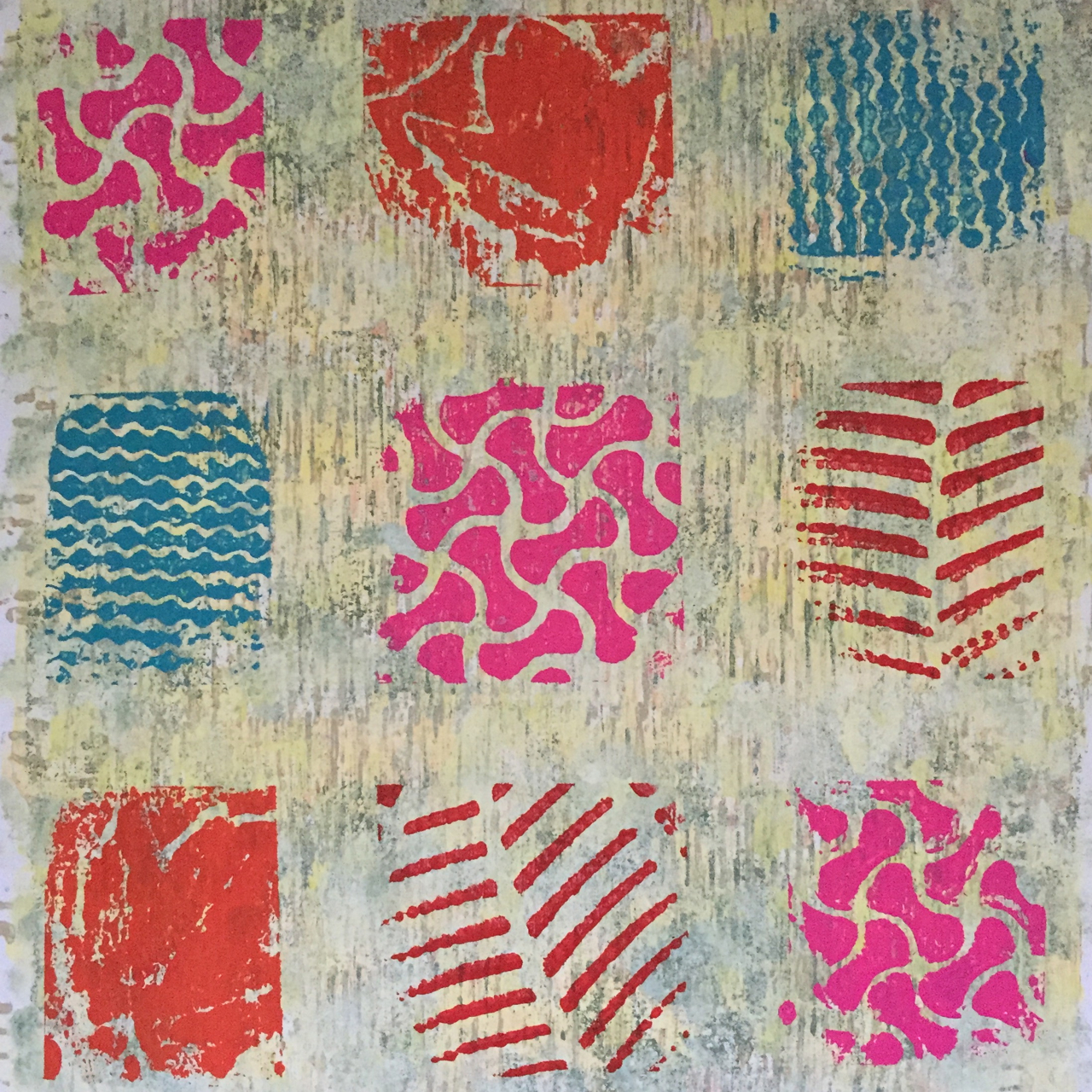
These images are created with prints from the soles of a number of my summer shoes. Rubber soles, which can be washed clean afterwards, obviously! I live in Birkenstock flip-flops, in a variety of bright colours, in the summer, so the coloured prints represent colourful summer shoes, treading on sun-bleached grass. The grass was printed in layers, using the ridged bottom of a plastic tray that originally contained tomatoes, as a make-shift printing stamp. I used various shades of buff, yellow, mocha, faded green and brown, softening with a sponge, where the lines looked a bit stark. I ran out of yellow printing ink, which was a nuisance and means that there isn't as much yellow in the grass as I wanted.
I am unhappy with the orange print tile. The print is blurred and the orange jars on me. I don't even have any orange shoes, but a pair of Oxygen flatties had these rather wonderful imprints of maple leaves in the sole, which were too tempting to pass up, and orange seemed a good idea at the time. Less so afterwards. I've printed directly onto the page in my book so I can't discard it, unfortunately.
The tile-effect is created by simple lines of masking tape, creating blank squares, onto which I pressed down the inked-up soles, carefully using scrap paper to cover up any squares not to be printed.

I'm much happier with the black and white version which shows the variety of pattern very clearly. Along with the Birkenstocks, I used an old pair of Sebago Docksiders, which I wear for summer walking, and a pair of Crocs I don't wear very often but keep in my shoe drawer because they're invaluable on a beach (and because they're bright pink!). The Birkenstocks and the Crocs printed fantastically - if you have a pair of either, take them to your paint pot and have a go! Just make sure you use something that will clean off completely afterwards! Water-based Speedball Relief Printing Ink is what I use and it washes off really easily, even if it's begun to dry. Acrylic paint won't wash off, once it's started to dry so avoid that, unless you are super quick at printing and know you will be cleaning up immediately afterwards.
This week's final efforts saw me return to where I ended last week - experimenting with collaged strips of watercolour-painted paper to create landscapes.

I love the clarity of line and the glowing colours of the watercolours. The first version is an imaginary landscape but the second is based on the local landscape of the Berkshire Downs and so incorporates another of this week's prompts, 'home'.


E x
Dear Mrs T
ReplyDeleteMore lovely experiments - I am enjoying following your progress. I love the leaf prints which work so well and the landscapes are beautiful. They would translate very well into a felt piece...
The yellow flowered plant may be a Lysimachia Punctata - yellow loosestrife?
Best wishes
Ellie
You are so right, Ellie - I think the collaged landscapes would translate across to felt excellently! You've started something there! I must have a look at what colours of felt I have but I suspect making one's own coloured panels would be best - over to you, Ellie! Do let me know if you decide to implement the idea - I'd love to see what you come up with! Thank you so much for the yellow loosetrife suggestion - I think you may be right. Have a good week! E x
DeleteWhenever I read your posts, I always think "Why didn't I think of that?". I love the idea of using your shoes to make patterned prints - even in orange. It's strange how different they look in black and white and it's good to know that if you want a fern like print, you just need to whip off your shoes.
ReplyDeleteI find that once I start looking at reflections, I can get a bit obsessed with finding the different layers and colours. I feel I should be able to translate them into something wonderful, a bit like those old-fashioned biology books where you start with the skin and fold back the page to reveal the muscles and so on back to the skeleton.
I'm really enjoying seeing how you interpret the themes.And enjoying your wonderful landscapes.
Thank you, Anne, and thank you above all for the inspiration of this whole challenge - it's proving so absorbing! Yes the Crocs print is very like a fern. There's a lot of places to go with the 'reflection' prompt - someone more able at drawing than me could also have a field day with reflections in glass, for example, and the whole layering idea is very inviting. As I said, to begin with, I wanted to include the original plants as well as the reflections but it just didn't work how I wanted it to. All agog to see what this week's theme and prompts are now! E x
DeleteYou are indeed an inspiration. I loved the prints, simple but so very effective. The landscape was a real delight, such beauty captured in paper.
ReplyDeleteThank you so much! I love printing even though things don't always come out how I want them to! E x
Delete